
Gainsight Branding
Brand Identity
The Scope
-
Gainsight, an industry giant in customer success, sought a bold and innovative way to highlight their products. We explored three distinct brand concepts to achieve this goal. The first concept, "Larger Than Life," focused on making Gainsight's products appear grand and impactful, using deep purple hues and the Paralucent typeface to convey technological savvy and fun. The second concept, "Spunky & Clever," which was ultimately chosen, emphasized Gainsight as a human-first brand by incorporating the "science of the smile," ensuring the audience always associates Gainsight with positivity and joy. The third concept, "Simple & Design Forward," aimed to balance simplicity and sophistication, with a clean design that highlights Gainsight's advanced approach to customer success.
-
For the "Larger Than Life" concept, the opportunity lay in creating a visually striking brand identity that merges people and products in a unique way. The deep purple color and Paralucent typeface were designed to draw attention and communicate Gainsight's technological edge and playful nature. The logo, featuring a subtle G and S joined by an arrow, symbolizes growth and scale.
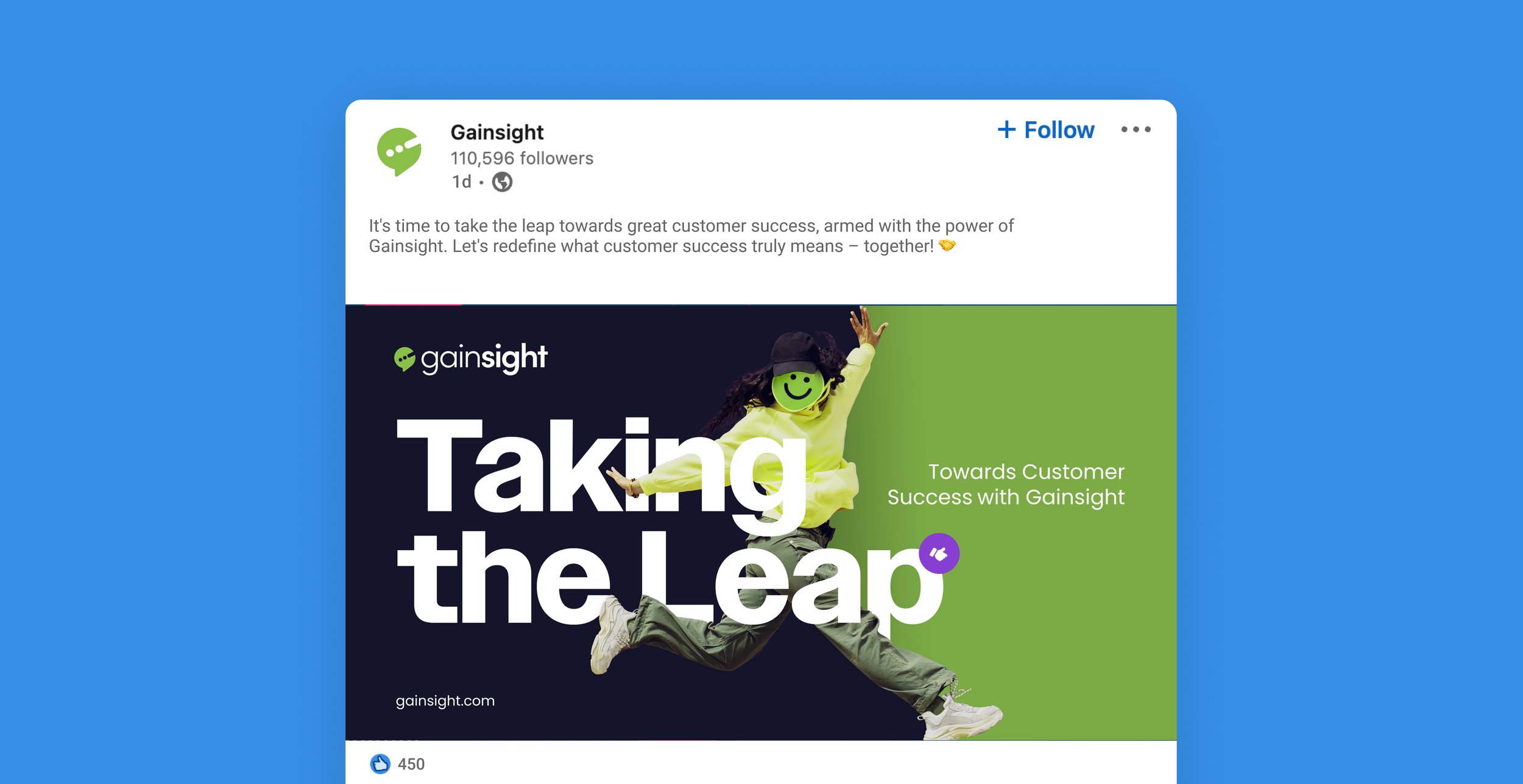
The "Spunky & Clever" concept presented an opportunity to make Gainsight's brand more approachable and emotionally engaging. By focusing on the "science of the smile," we aimed to create a brand that feels friendly and genuine. The logo, a speech bubble with Morse code G, emphasizes this communicative and welcoming approach.
The "Simple & Design Forward" concept offered a chance to showcase Gainsight's duality of being simple yet advanced. This concept focused on keeping the design clean and minimalist, with ample white space and a clear, engaging product UI.
-
The "Larger Than Life" concept faced the challenge of balancing bold, eye-catching visuals with a clean and non-distracting design. Ensuring the deep purple color and Paralucent typeface did not overwhelm the brand's message required careful consideration.
For the "Spunky & Clever" concept, the main challenge was integrating the "science of the smile" in a way that felt natural and not gimmicky. Ensuring that the playful and human-centric approach resonated with a professional audience required a delicate balance.
The "Simple & Design Forward" concept needed to maintain a fine line between simplicity and engagement. The challenge was to ensure that the minimalist design did not come across as too sterile or boring, while still highlighting the advanced nature of Gainsight's products.


More Portfolio Gems Inside
Brace Yourself
